Passenger vehicle registrations by type
These interactive charts show the breakdown of new passenger vehicle registrations by type.
This is broken down by: petroleum; diesel; full hybrid (excluding plug-in hybrids); plug-in electric hybrids; and fully electric battery vehicles.
Electric vehicle registrations
This interactive chart shows the share of new passenger vehicle registrations that are battery electric vehicles. This does not include plug-in hybrid vehicles.
This interactive chart shows the share of new passenger vehicle registrations that are battery electric plus plug-in hybrid vehicles.
Carbon intensity of new passenger vehicles
This interactive chart shows the average carbon intensity of new passenger vehicles in each country.
This is measured as the average emissions of CO₂ (in grams) per kilometer travelled across all types of passenger vehicles.
Fuel economy of new passenger vehicles
This interacrive chart shows the average fuel economy of new passenger vehicles in each country.
This is measured as the average liters consumed per 100 kilometers travelled, across all types of passenger vehicles.
What share of global CO2 emissions come from aviation?
Flying is a highly controversial topic in climate debates. There are a few reasons for this.
The first is the disconnect between its role in our personal and collective carbon emissions. Air travel dominates a frequent traveller’s individual contribution to climate change. Yet aviation overall accounts for only 2.5% of global carbon dioxide (CO2) emissions. This is because there are large inequalities in how much people fly – many do not, or cannot afford to, fly at all [best estimates put this figure at around 80% of the world population – we will look at this in more detail in an upcoming article].
The second is how aviation emissions are attributed to countries. CO2 emissions from domestic flights are counted in a country’s emission accounts. International flights are not – instead they are counted as their own category: ‘bunker fuels’. The fact that they don’t count towards the emissions of any country means there are few incentives for countries to reduce them.
It’s also important to note that unlike the most common greenhouse gases – carbon dioxide, methane or nitrous oxide – non-CO2 forcings from aviation are not included in the Paris Agreement. This means they could be easily overlooked – especially since international aviation is not counted within any country’s emissions inventories or targets.
How much of a role does aviation play in global emissions and climate change? In this article we take a look at the key numbers that are useful to know.
Global aviation (including domestic and international; passenger and freight) accounts for:
- 1.9% of greenhouse gas emissions (which includes all greenhouse gases, not only CO2)
- 2.5% of CO2 emissions
- 3.5% of ‘effective radiative forcing’ – a closer measure of its impact on warming.
The latter two numbers refer to 2018, and the first to 2016, the latest year for which such data are available.
As we will see later in this article, there are a number of processes by which aviation contributes to climate change. But the one that gets the most attention is its contribution via CO2 emissions. Most flights are powered by jet gasoline – although some partially run on biofuels – which is converted to CO2 when burned.
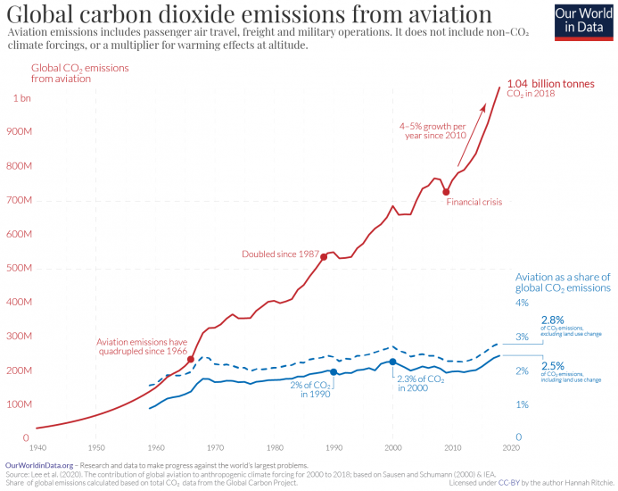
In a recent paper, researchers – David Lee and colleagues – reconstructed annual CO2 emissions from global aviation dating back to 1940.1 This was calculated based on fuel consumption data from the International Energy Agency (IEA), and earlier estimates from Robert Sausen and Ulrich Schumann (2000).2
The time series of global emissions from aviation since 1940 is shown in the accompanying chart. In 2018, it’s estimated that global aviation – which includes both passenger and freight – emitted 1.04 billion tonnes of CO2.
This represented 2.5% of total CO2 emissions in 2018.3,4
Aviation emissions have doubled since the mid-1980s. But, they’ve been growing at a similar rate as total CO2 emissions – this means its share of global emissions has been relatively stable: in the range of 2% to 2.5%.5
Aviation accounts for around 2.5% of global CO2 emissions, but it’s overall contribution to climate change is higher. This is because air travel does not only emit CO2: it affects the climate in a number of more complex ways.
As well as emitting CO2 from burning fuel, planes affect the concentration of other gases and pollutants in the atmosphere. They result in a short-term increase, but long-term decrease in ozone (O3); a decrease in methane (CH4); emissions of water vapour; soot; sulfur aerosols; and water contrails. While some of these impacts result in warming, others induce a cooling effect. Overall, the warming effect is stronger.
David Lee et al. (2020) quantified the overall effect of aviation on global warming when all of these impacts were included.6 To do this they calculated the so-called ‘Radiative Forcing’. Radiative forcing measures the difference between incoming energy and the energy radiated back to space. If more energy is absorbed than radiated, the atmosphere becomes warmer.
In this chart we see their estimates for the radiative forcing of the different elements. When we combine them, aviation accounts for approximately 3.5% of effective radiative forcing: that is, 3.5% of warming.
Although CO2 gets most of the attention, it accounts for less than half of this warming. Two-thirds (66%) comes from non-CO2 forcings. Contrails – water vapor trails from aircraft exhausts – account for the largest share.
Aviation’s contribution to climate change – 3.5% of warming, or 2.5% of CO2 emissions – is often less than people think. It’s currently a relatively small chunk of emissions compared to other sectors.
The key challenge is that it is particularly hard to decarbonize. We have solutions to reduce emissions for many of the largest emitters – such as power or road transport – and it’s now a matter of scaling them. We can deploy renewable and nuclear energy technologies, and transition to electric cars. But we don’t have proven solutions to tackle aviation yet.
There are some design concepts emerging – Airbus, for example, have announced plans to have the first zero-emission aircraft by 2035, using hydrogen fuel cells. Electric planes may be a viable concept, but are likely to be limited to very small aircraft due to the limitations of battery technologies and capacity.
Innovative solutions may be on the horizon, but they’re likely to be far in the distance.
Appendix: Efficiency improvements means air traffic has increased more rapidly than emissions
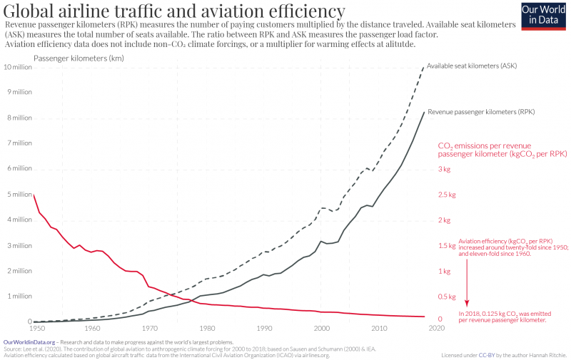
Global emissions from aviation have increased a lot over the past half-century. However, air travel volumes increased even more rapidly.
Since 1960, aviation emissions increased almost seven-fold; since 1970 they’ve tripled. Air traffic volume – here defined as revenue passenger kilometers (RPK) traveled – increased by orders of magnitude more: almost 300-fold since 1950; and 75-fold since 1960 [you find this data in our interactive chart here].7
The much slower growth in emissions means aviation efficiency has seen massive improvements. In the chart we show both the increase in global airline traffic since 1950, and aviation efficiency, measured as the quantity of CO2 emitted per revenue passenger kilometer traveled. In 2018, approximately 125 grams of CO2 were emitted per RPK. In 1960, this was eleven-fold higher; in 1950 it was twenty-fold higher. Aviation has seen massive efficiency improvements over the past 50 years.
These improvements have come from several sources: improvements in the design and technology of aircraft; larger aircraft sizes (allowing for more passengers per flight); and an increase in how ‘full’ passenger flights are. This last metric is termed the ‘passenger load factor’. The passenger load factor measures the actual number of kilometers traveled by paying customers (RPK) as a percentage of the available seat kilometers (ASK) – the kilometers traveled if every plane was full. If every plane was full the passenger load factor would be 100%. If only three-quarters of the seats were filled, it would be 75%.
The global passenger load factor increased from 61% in 1950 to 82% in 2018 [you find this data in our interactive chart here].
Passenger vs. freight; domestic vs. international: where do aviation emissions come from?
Global aviation – both passenger flights and freight – emits around one billion tonnes of carbon dioxide (CO2) each year. This was equivalent to around 2.4% of CO2 emissions in 2018.
How do global aviation emissions break down?
The chart gives the answer. This data is sourced from the 2019 International Council on Clean Transportation (ICCT) report on global aviation.8
Most emissions come from passenger flights – in 2018, they accounted for 81% of aviation’s emissions; the remaining 19% came from freight, the transport of goods.
Sixty percent of emissions from passenger flights come from international travel; the other 40% come from domestic (in-country) flights.
When we break passenger flight emissions down by travel distance, we get a (surprisingly) equal three-way split in emissions between short-haul (less than 1,500 kilometers); medium-haul (1,500 to 4,000 km); and long-haul (greater than 4,000 km) journeys.
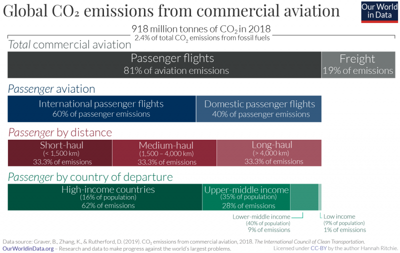
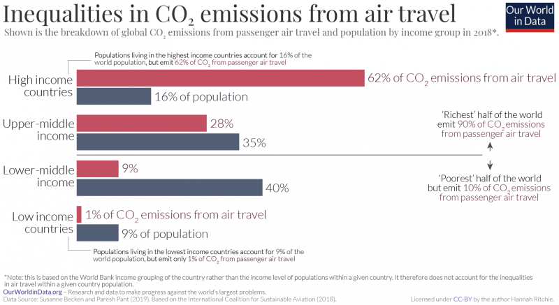
The global inequalities in how much people fly become clear when we compare aviation emissions across countries of different income levels. The ICCT split these emissions based on World Bank’s four income groups.
A further study by Susanne Becek and Paresh Pant (2019) compared the contribution of each income group to global air travel emissions versus its share of world population.9 This comparison is shown in the visualization.
The ‘richest’ half of the world (high and upper-middle income countries) were responsible for 90% of air travel emissions.10
Looking at specific income groups:
- Only 16% of the world population live in high-income countries yet the planes that take off in those countries account for almost two-thirds (62%) of passenger emissions;
- Upper-middle income countries are home to 35% of the world population, and contribute 28% of emissions;
- Lower-middle income countries are home to the largest share (40% of the world), yet emit the planes taking off there just account for 9%;
- The poorest countries – which are home to 9% of the world population – emit just 1%.
In an upcoming article we will look in more detail at the contribution of each country to global aviation emissions.
Where in the world do people have the highest carbon footprint from flying?
Aviation accounts for around 2.5% of global carbon dioxide (CO2) emissions. But if you are someone who does fly, air travel will make up a much larger share of your personal carbon footprint.
The fact that aviation is relatively small for global emissions as a whole, but of large importance for individuals that fly is due to large inequalities in the world. Most people in the world do not take flights. There is no global reliable figure, but often cited estimates suggest that more than 80% of the global population have never flown.11
How do emissions from aviation vary across the world? Where do people have the highest footprint from flying?
The first and most straightforward comparison is to look at emissions from domestic aviation – that is, flights that depart and arrive in the same country.
This is easiest to compare because domestic aviation is counted in each country’s inventory of greenhouse gas emissions. International flights, on the other hand, are not attributed to specific countries – partly because of contention as to who should take responsibility (should it be the country of departure or arrival? What about layover flights?).
In the chart here we see the average per capita emissions from domestic flights in 2018. This data is sourced from the International Council on Clean Transportation – we then used UN population estimates to calculate per capita figures.12,13
We see large differences in emissions from domestic flights across the world. In the United States the average person emits around 386 kilograms of CO2 each year from internal flights. This is followed by Australia (267 kg); Norway (209 kg); New Zealand (174 kg); and Canada (168 kg). Compare this with countries at the bottom of the table – many across Africa, Asia, and Eastern Europe in particular emit less than one kilogram per person – just 0.8 kilograms; or 0.14 kilograms in Rwanda. For very small countries where there are no internal commercial flights, domestic emissions are of course, zero.
There are some obvious factors that explain some of these cross-country differences. Firstly, countries that are richer are more likely to have higher emissions because people can afford to fly. Second, countries that have a larger land mass may have more internal flights – and indeed we see a correlation between land area and domestic flight emissions; in small countries people are more likely to travel by other means such as car or train. And third, countries that are more geographically-isolated – such as Australia and New Zealand – may have more internal travel.
Allocating emissions from international flights is more complex. International databases report these emissions separately as a category termed ‘bunker fuels’. The term ‘bunker fuel’ is used to describe emissions which come from international transport – either aviation or shipping.
Because they are not counted towards any particular country these emissions are also not taken into account in the goals that are set by countries in international treaties like the Kyoto protocol or the Paris Agreement.14
But if we wanted to allocate them to a particular country, how would we do it? Who do emissions from international flights belong to: the country that owns the airline; the country of departure; the country of arrival?
Let’s first take a look at how emissions would compare if we allocated them to the country of departure. This means, for example, that emissions from any flight that departs from Spain are counted towards Spain’s total. In the chart here we see international aviation emissions in per capita terms.
Some of the largest emitters per person in 2018 were Iceland (3.5 tonnes of CO2 per person); Qatar (2.5 tonnes); United Arab Emirates (2.2 tonnes); Singapore (1.7 tonnes); and Malta (992 kilograms).
Again, we see large inequalities in emissions across the world – in many lower-income countries per capita emissions are only a few kilograms: 6 kilograms in India, 4 kilograms in Nigeria; and only 1.4 kilograms in the Democratic Republic of Congo.
The above allocation of international aviation emissions to the country of departure raises some issues. It is not an accurate reflection of the local population of countries that rely a lot on tourism, for example. Most of the departing flights from these countries are carrying visiting tourists rather than locals.
One way to correct for this is to adjust these figures for the ratio of inbound to outbound travellers. This approach was applied in an analysis by Sola Zheng for the International Council on Clean Transportation. This attempts to distinguish between locals traveling abroad and foreign visitors traveling to that country on the same flight.15 For example, if we calculated that Spain had 50% more incoming than outgoing travellers, we would reduce its per capita footprint from flying by 50%. If the UK had 75% more outgoing travellers than incoming, we’d increase its footprint by 75%.
We have replicated this approach and applied this adjustment to these figures by calculating the inbound:outbound tourist ratio based on flight departures and arrival data from the World Bank.
How does this affect per capita emissions from international flights? The adjusted figures are shown in the chart here.
As we would expect, countries which are tourist hotspots see the largest change. Portugal’s emissions, for example, fall from 388 to just 60 kilograms per person. Portuguese locals are responsible for much fewer travel emissions than outgoing tourists. Spanish emissions fall from 335 to 77 kilograms per person.
On the other hand, countries where the locals travel elsewhere see a large increase. In the UK, they almost double from 422 to 818 kilograms.
Let’s combine per capita emissions from domestic and international travel to compare the total footprint from flying.
This is shown in the interactive map [we’ve taken the adjusted international figures – you can find the combined figures without tourism-adjustment here].
The global average emissions from aviation were 103 kilograms. The inequality in emissions across the world becomes clear when this is broken down by country.
At the top of the table lies the United Arab Emirates – each person emits close to two tonnes – 1950 kg – of CO2 from flying each year. That’s 200 times the global average. This was followed by Singapore (1173 kilograms); Iceland (1070 kg); Finland (1000 kg); and Australia (878 kilograms).
To put this into perspective: a return flight (in economy class) from London to Dubai/United Arab Emirates would emit around one tonne of CO2.16 So the two-tonne average for the UAE is equivalent to around two return trips to London.
In many countries, most people do not fly at all. The average Indian emits just 18 kilograms from aviation – this is much, much less than even a short-haul flight which confirms that most did not take a flight.
In fact, we can compare just the aviation emissions for the top countries to the total carbon footprint of citizens elsewhere. The average UAE citizen emits 1950 kilograms of CO2 from flying. This is the same as the total CO2 footprint of the average Indian (including everything from electricity to road transport, heating and industry). Or, to take a more extreme example, 200 times the total footprint of the average Nigerien, Ugandan or Ethiopian, which have per capita emissions of around 100 kilograms.
This again emphasises the large difference between the global average and the individual emissions of people who fly. Aviation contributes a few percent of total CO2 emissions each year – this is not insignificant, but far from being the largest sector to tackle. Yet from the perspective of the individual, flying is often one of the largest chunks of our carbon footprint. The average rich person emits tonnes of CO2 from flying each year – this is equivalent to the total carbon footprint of tens or hundreds of people in many countries of the world.
Where in the world do people fly the most?
This interactive chart shows the average distance travelled per person through domestic air travel each year. This data is for passenger flights only and does not include freight.
This interactive chart shows the average distance travelled per person through international air travel each year. This data is for passenger flights only and does not include freight.
This interactive chart shows the average distance travelled per person through domestic and international air travel each year. This data is for passenger flights only and does not include freight.
This interactive chart shows the total rail travel in each country, measured in passenger-kilometers per year.
This includes passenger travel only and does not include freight.
This chart shows the average energy intensity of transport across different modes of travel. It is measured as the average kilowatt-hours required per passenger-kilometer.
This data comes from the United States Department of Transportation’s Bureau of Transportation Statistics (BTS). The energy intensity of public transport depends on the assumptions made about the capacity of transport modes i.e. how many passengers travel on a given train or bus journey. This data thererfore reflects average capacities in the United States, but will vary from country-to-country.
Per capita transport emissions from transport
This interactive shows the average per capita emissions of carbon dioxide from transport each year. This includes road, train, bus and domestic air travel but does not include international aviation and shipping.
Total transport emissions
This interactive shows the emissions of carbon dioxide from transport each year. This includes road, train, bus and domestic air travel but does not include international aviation and shipping.
CO2 emissions by mode of transport
Transport accounts for around one-fifth of global carbon dioxide (CO2) emissions [24% if we only consider CO2 emissions from energy].17
How do these emissions break down? Is it cars, trucks, planes or trains that dominate?
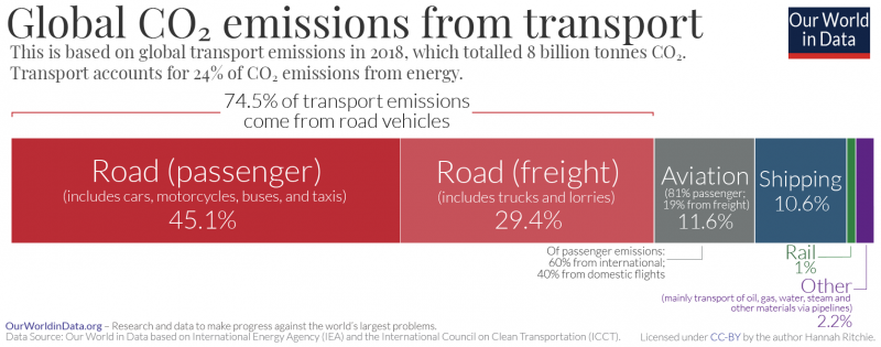
In the chart here we see global transport emissions in 2018. This data is sourced from the International Energy Agency (IEA).
Road travel accounts for three-quarters of transport emissions. Most of this comes from passenger vehicles – cars and buses – which contribute 45.1%. The other 29.4% comes from trucks carrying freight.
Since the entire transport sector accounts for 21% of total emissions, and road transport accounts for three-quarters of transport emissions, road transport accounts for 15% of total CO2 emissions.
Aviation – while it often gets the most attention in discussions on action against climate change – accounts for only 11.6% of transport emissions. It emits just under one billion tonnes of CO2 each year – around 2.5% of total global emissions [we look at the role that air travel plays in climate change in more detail in an upcoming article]. International shipping contributes a similar amount, at 10.6%.
Rail travel and freight emits very little – only 1% of transport emissions. Other transport – which is mainly the movement of materials such as water, oil, and gas via pipelines – is responsible for 2.2%.
Towards zero-carbon transport: how can we expect the sector’s CO2 emissions to change in the future?
Transport demand is expected to grow across the world in the coming decades as the global population increases, incomes rise, and more people can afford cars, trains and flights. In its Energy Technology Perspectives report, the International Energy Agency (IEA) expects global transport (measured in passenger-kilometers) to double, car ownership rates to increase by 60%, and demand for passenger and freight aviation to triple by 2070.18 Combined, these factors would result in a large increase in transport emissions.
But major technological innovations can help offset this rise in demand. As the world shifts towards lower-carbon electricity sources, the rise of electric vehicles offers a viable option to reduce emissions from passenger vehicles.
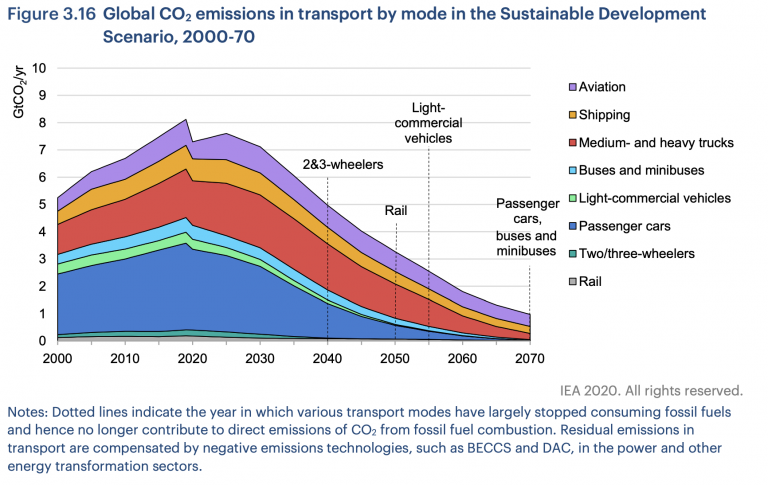
This is reflected in the IEA’s Energy Technology Perspective report. There it outlines its “Sustainable Development Scenario” for reaching net-zero CO2 emissions from global energy by 2070. The pathways for the different elements of the transport sector in this optimistic scenario are shown in the visualization.
We see that with electrification- and hydrogen- technologies some of these sub-sectors could decarbonize within decades. The IEA scenario assumes the phase-out of emissions from motorcycles by 2040; rail by 2050; small trucks by 2060; and although emissions from cars and buses are not completely eliminated until 2070, it expects many regions, including the European Union; United States; China and Japan to have phased-out conventional vehicles as early as 2040.
Other transport sectors will be much more difficult to decarbonize.
In a paper published in Science, Steven Davis and colleagues looked at our options across sectors to reach a net-zero emissions energy system.19 They highlighted long-distance road freight (large trucks), aviation and shipping as particularly difficult to eliminate. The potential for hydrogen as a fuel, or battery electricity to run planes, ships and large trucks is limited by the range and power required; the size and weight of batteries or hydrogen fuel tanks would be much larger and heavier than current combustion engines.20,21
So, despite falling by three-quarters in the visualized scenario, emissions from these sub-sectors would still make transport the largest contributor to energy-related emissions in 2070. To reach net-zero for the energy sector as a whole, these emissions would have to be offset by ‘negative emissions’ (e.g. the capture and storage of carbon from bioenergy or direct air capture) from other parts of the energy system.
In the IEA’s net-zero scenario, nearly two-thirds of the emissions reductions come from technologies that are not yet commercially available. As the IEA states, “Reducing CO2 emissions in the transport sector over the next half-century will be a formidable task.”22
Global CO2 emissions from transport in the IEA’s Sustainable Development Scenario to 207023


